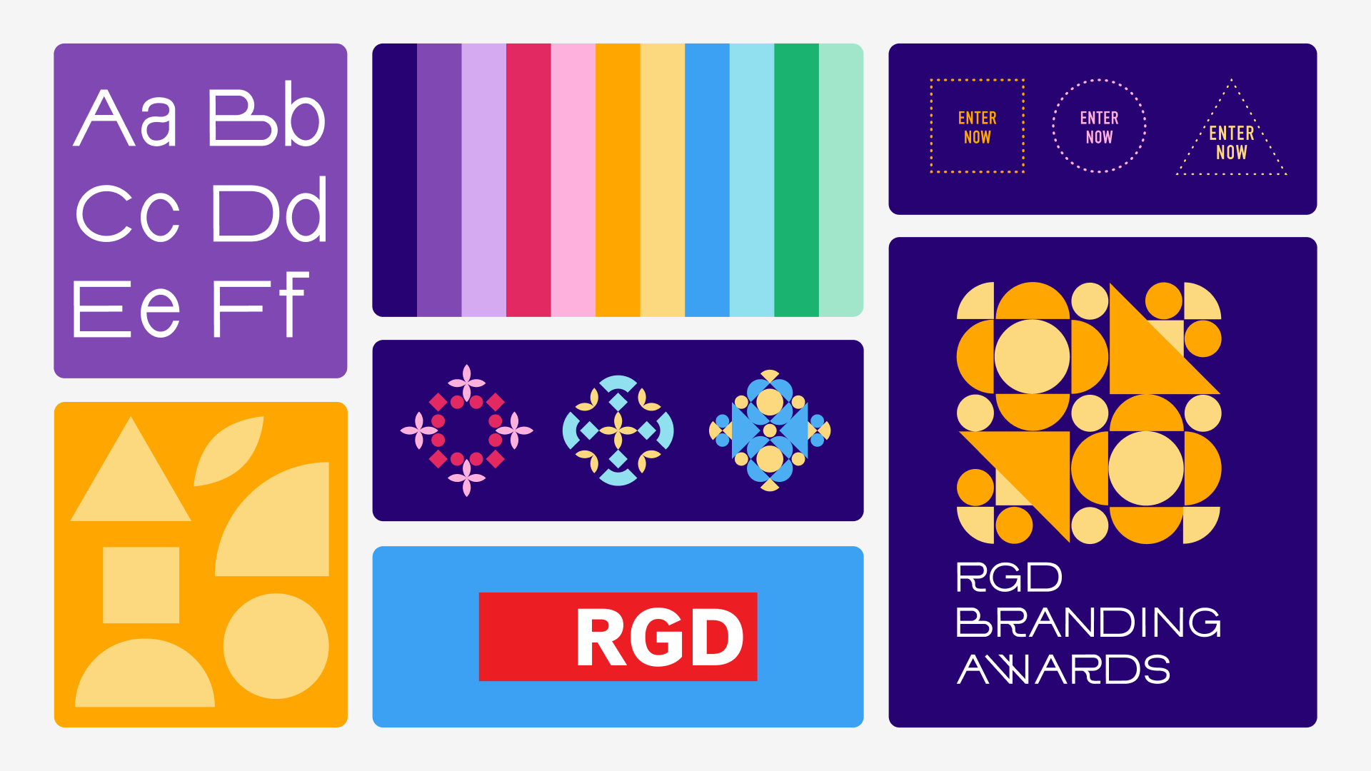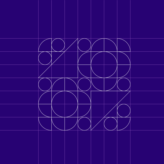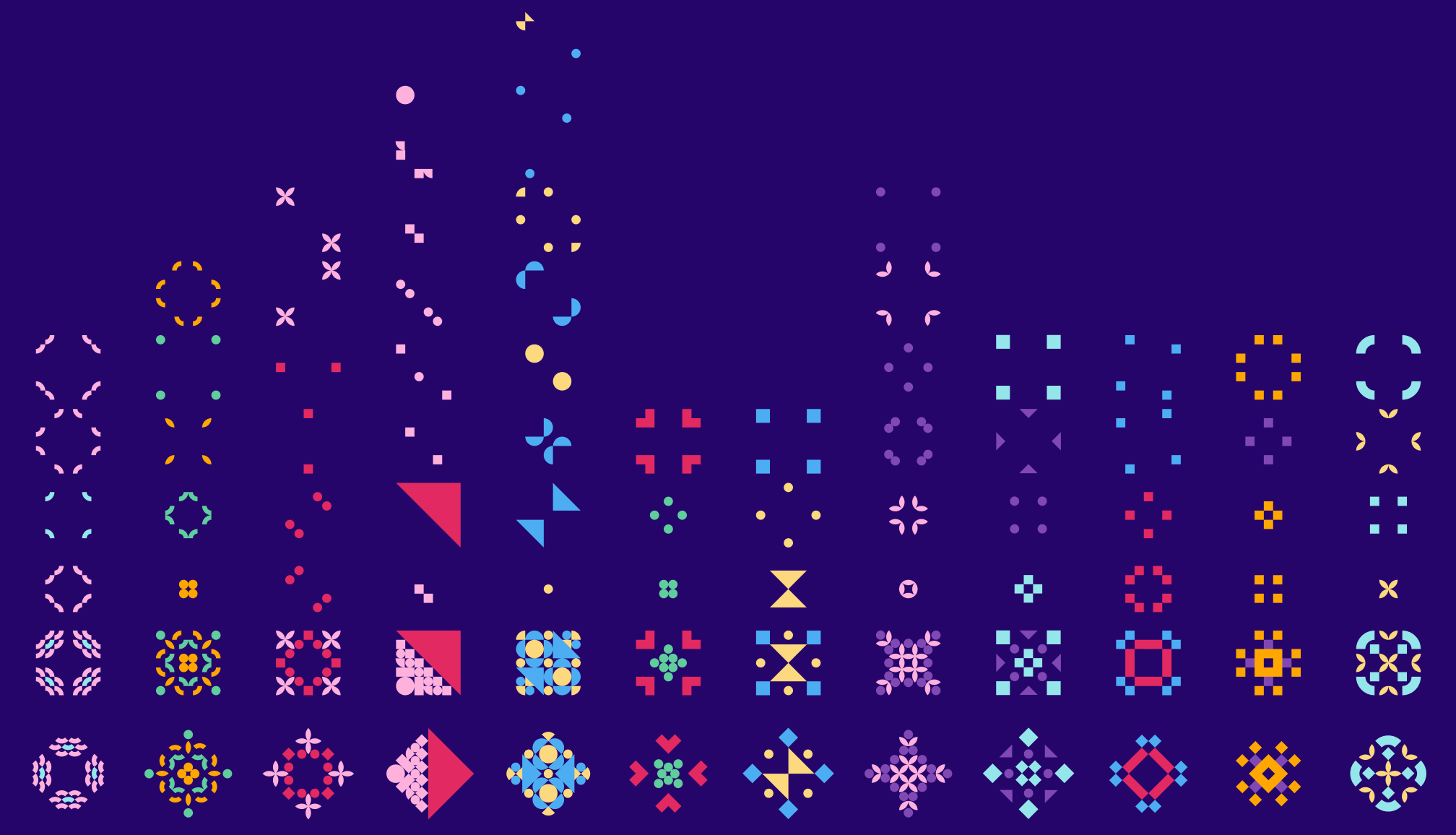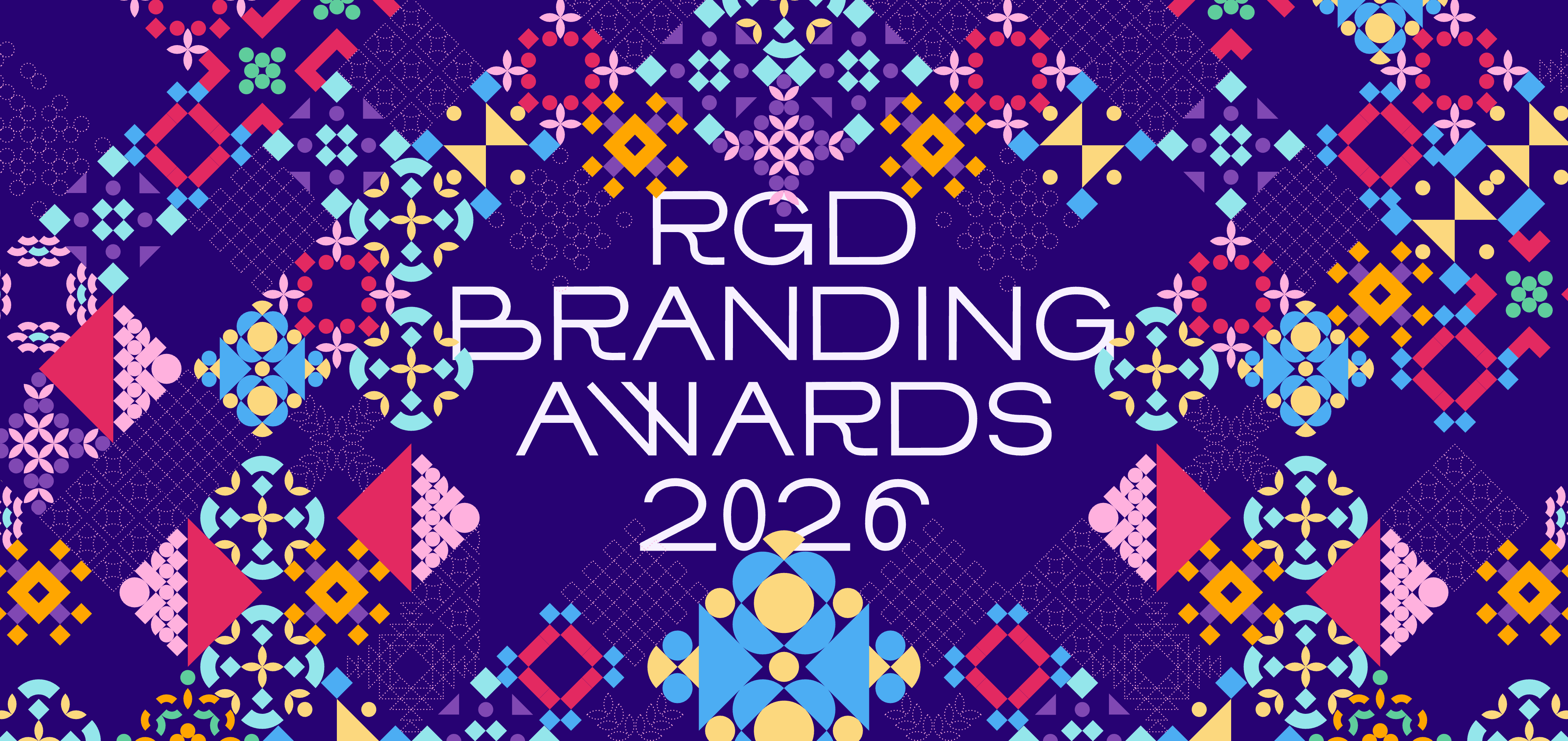

Our starting point was a question about what branding looks like now. The strongest contemporary identities are not fixed marks but living languages, flexible, expressive, and built to move across contexts. Our early exploration cast a wide net, from glitch art and pixel fonts to tangrams, quilting, and historical trademarks, and one idea kept rising to the surface: a finite set of elements capable of generating endless vivid, recognizable outcomes.
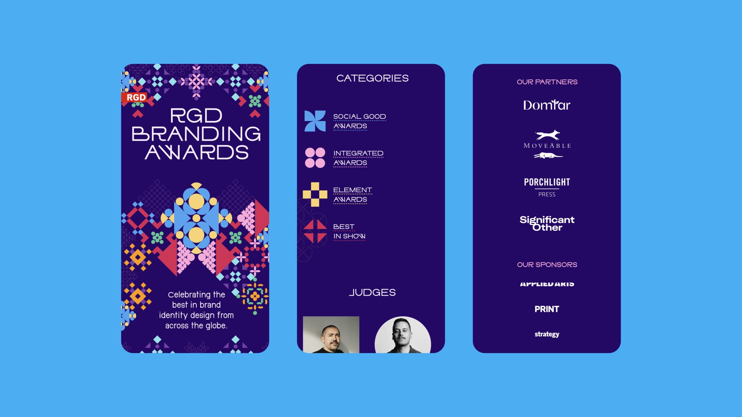
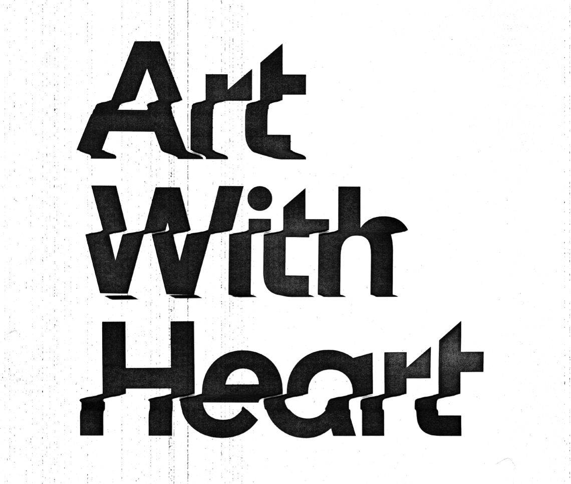
That idea became Infinite Expression. Kaleidoscopic recombination, reflected forms, asymmetrical layouts, and vibrant colour combine into a system that feels celebratory and contemporary while staying unmistakably coherent. Typography sharpens the voice: DINdong brings an unexpected, slightly unconventional personality that keeps the identity full of character without losing clarity.
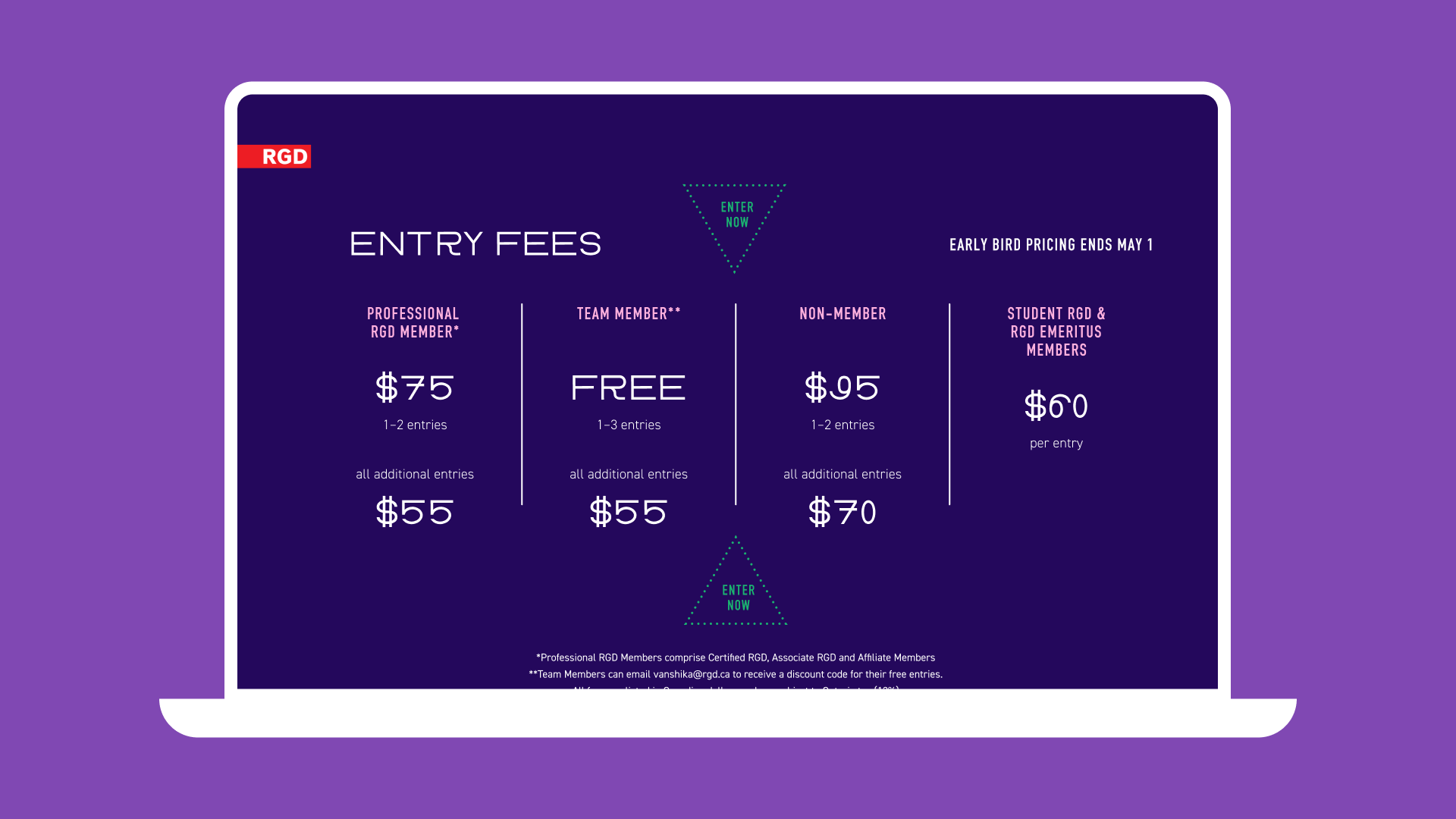
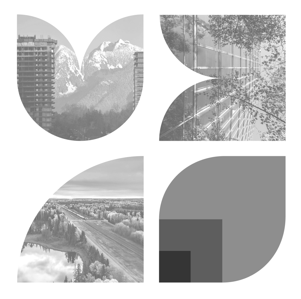
Refinement was as much about restraint as expression. We reduced and edited the pattern language, introduced more intentional negative space, and tested the system across static and motion applications. The more carefully we controlled it, the more elevated it became. In campaign moments, the identity is loud, energetic, and highly visible. In winner-focused applications, it steps back and becomes architectural, framing the work without competing with it. That ability to shift registers was essential to the brief, and it became the system’s greatest strength.