The brand refresh represents bold transformation. The contemporary design language captures the progressive and energetic spirit of the people who embody the brand. The newly enhanced templates for everything from brochures to stationery to signage and sales materials are streamlined and sophisticated. The refreshed brand has been embraced by the Commercial team across Canada, resonating with their preference for modern, innovative tools that are flexible and easy to use. Among their clientele, it has improved the perception of an already trusted brand, reinforcing its reputation for expertise and innovation.

Royal LePage Commercial
Royal LePage Commercial is the highly respected commercial property division of Canada’s most trusted real estate brand. As a platform for entrepreneurship within the commercial real estate sector, it fosters a unique environment where self-driven agents can take charge of their careers and earning potential. With a trusted name that is recognized across Canada for unmatched expertise, cutting edge innovation and superior customer service, clients expect more from Royal LePage Commercial.
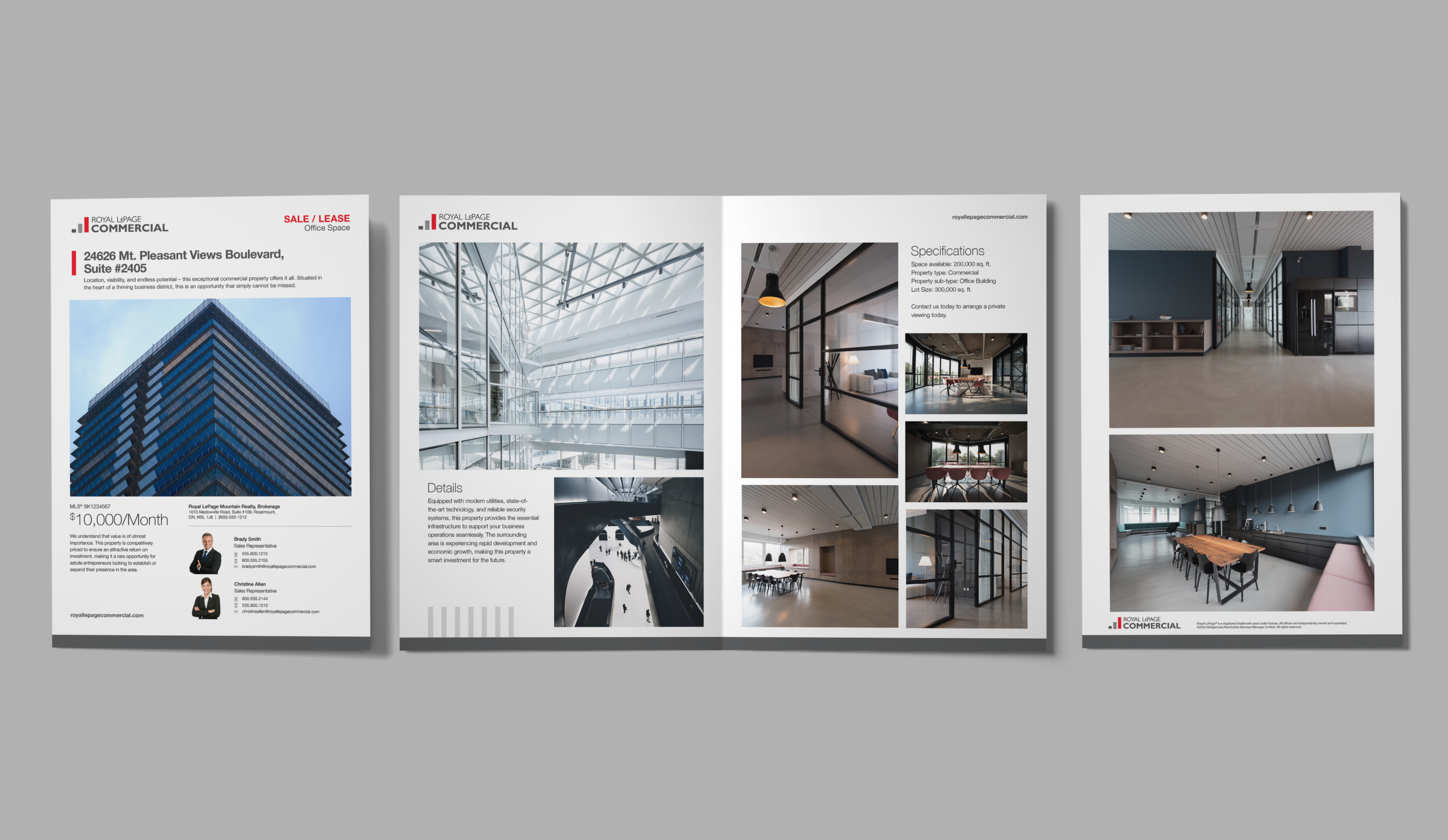
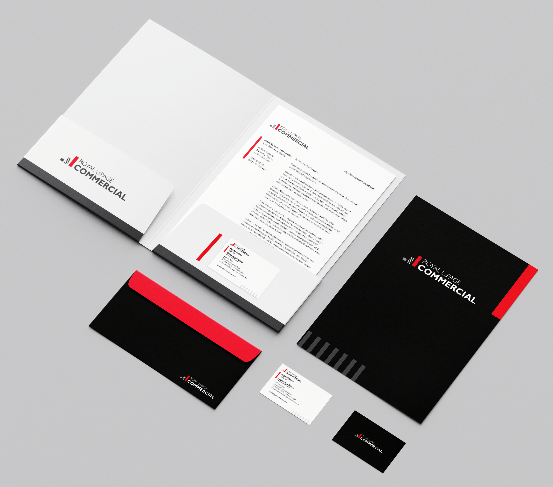
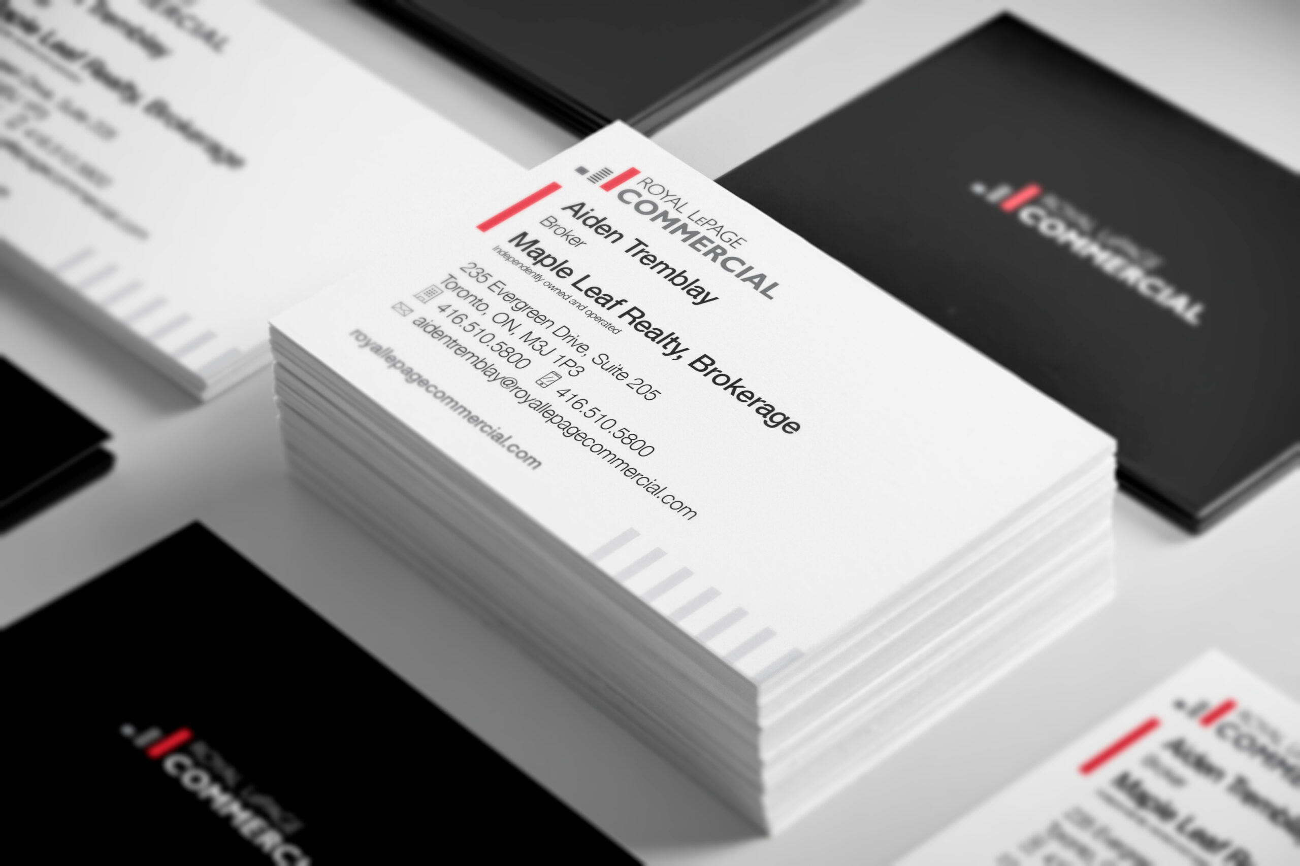
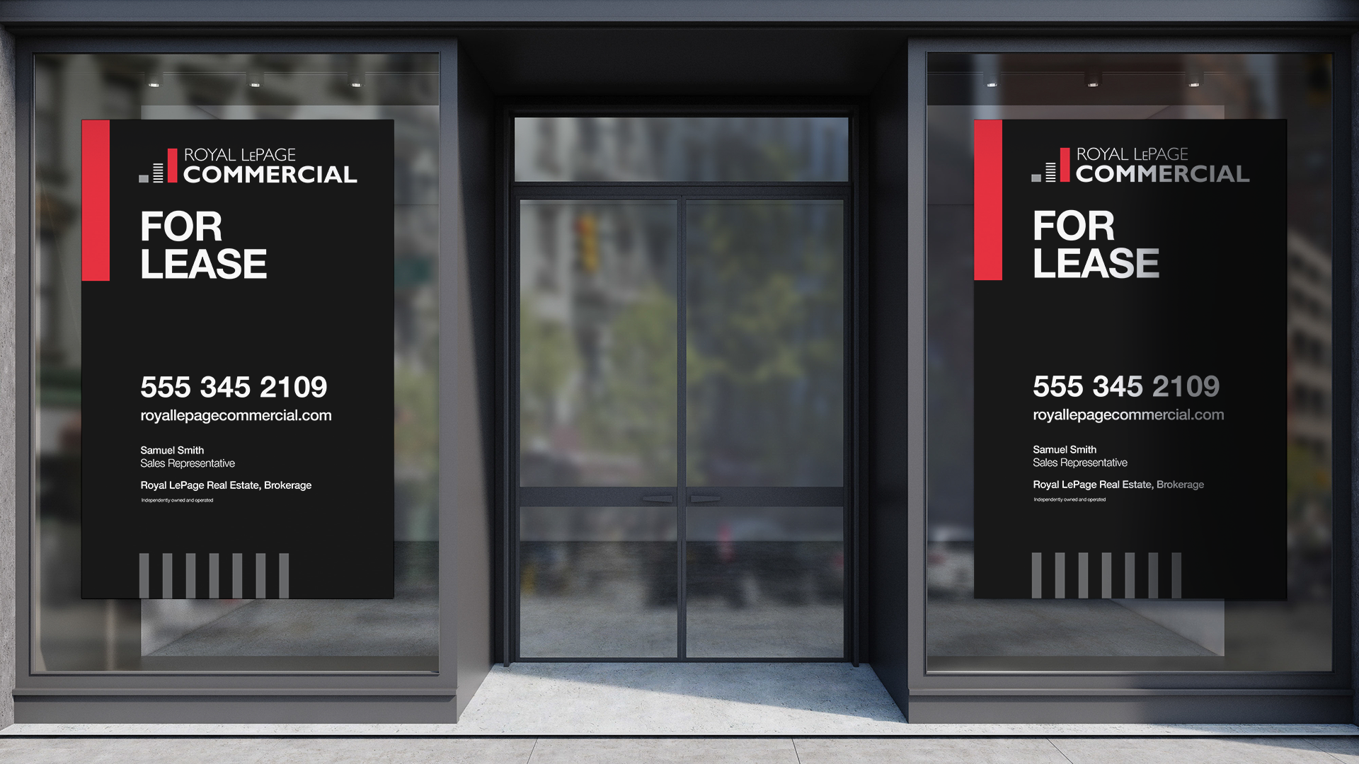
Royal LePage enlisted the help of Significant Other to give their Commercial division a visual refresh, strengthen the connection to the parent brand, and create a flexible design system that reflects the modern and innovative needs of the organization. The existing identity lacked a significant link to Royal LePage, and all of the recognition and trust that it might bring, and brand assets such as signs, stationery, presentation decks, social media templates, and other recruiting tools were in need of a refresh to bring better consistency and reflect the modern tools and approaches that franchise owners preferred.
The refreshed visual identity is modern, sleek, and represents the fresh, innovative, exclusive, and knowledgeable people behind the brand. It appeals to both potential agents who might be considering joining the Royal LePage team, and prospect clients looking to buy or sell a commercial property.
Leveraging key elements from the familiar Royal LePage identity, the new Commercial logo helps maintain consistency and build instant recognition. Accent elements, inspired by the skyscrapers icon, feature heavily throughout the branded materials, and provide a structure, depth, and a strong foundation for all types of content.
- Services
- Brand Strategy, Motion Graphics, Visual Identity


We’d love to explore how our team can bring your next project to life. Let’s start the conversation.
Let's Talk
Copyright © 2026 § EST 2013
YYZ YWG ITA IRL & BEYOND