That’s where we came in.
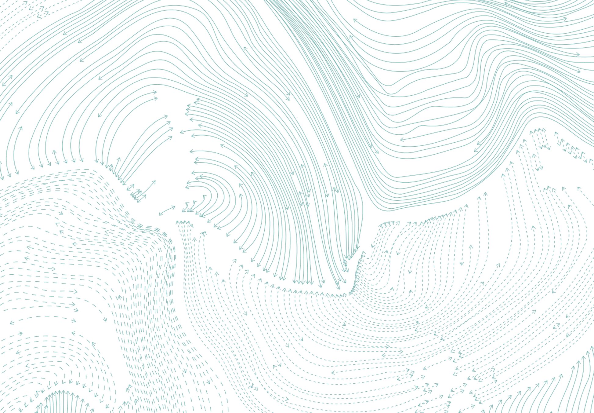
Our team began by immersing ourselves in the world of academic publishing. We spoke with researchers, editors, and contributors to understand how E&S was seen—and how it needed to be seen. We pored over its history, determined to honour its legacy while imagining its future. And we found inspiration in the “tools of the trade” that underpin ecological science: GIS mapping, spatial data, layered visual systems.
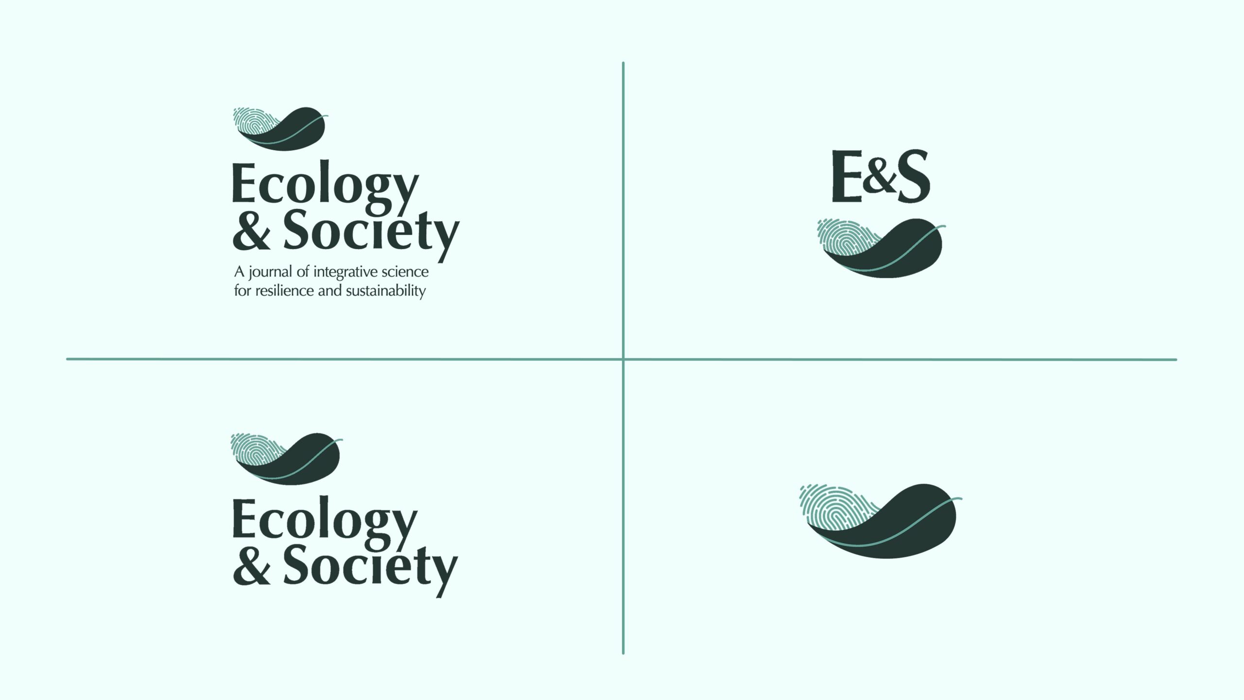
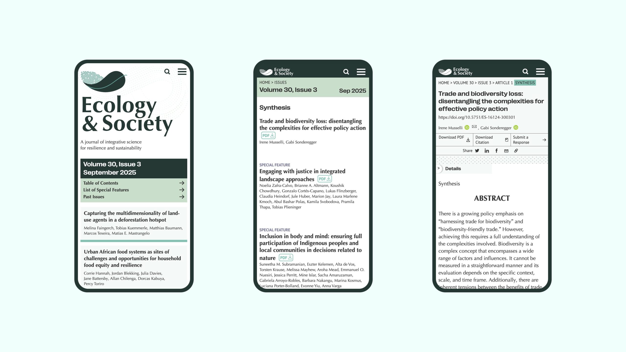
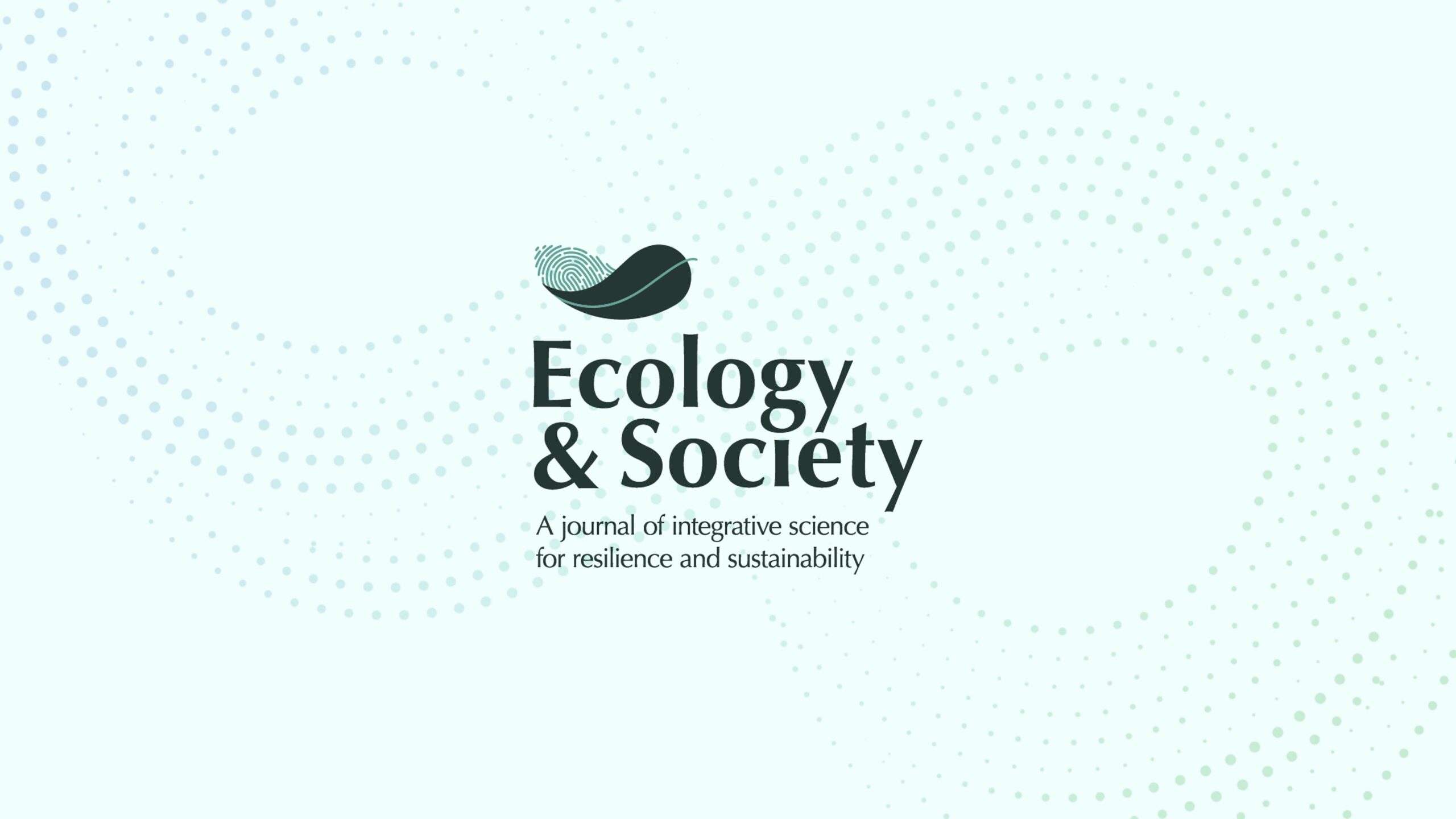
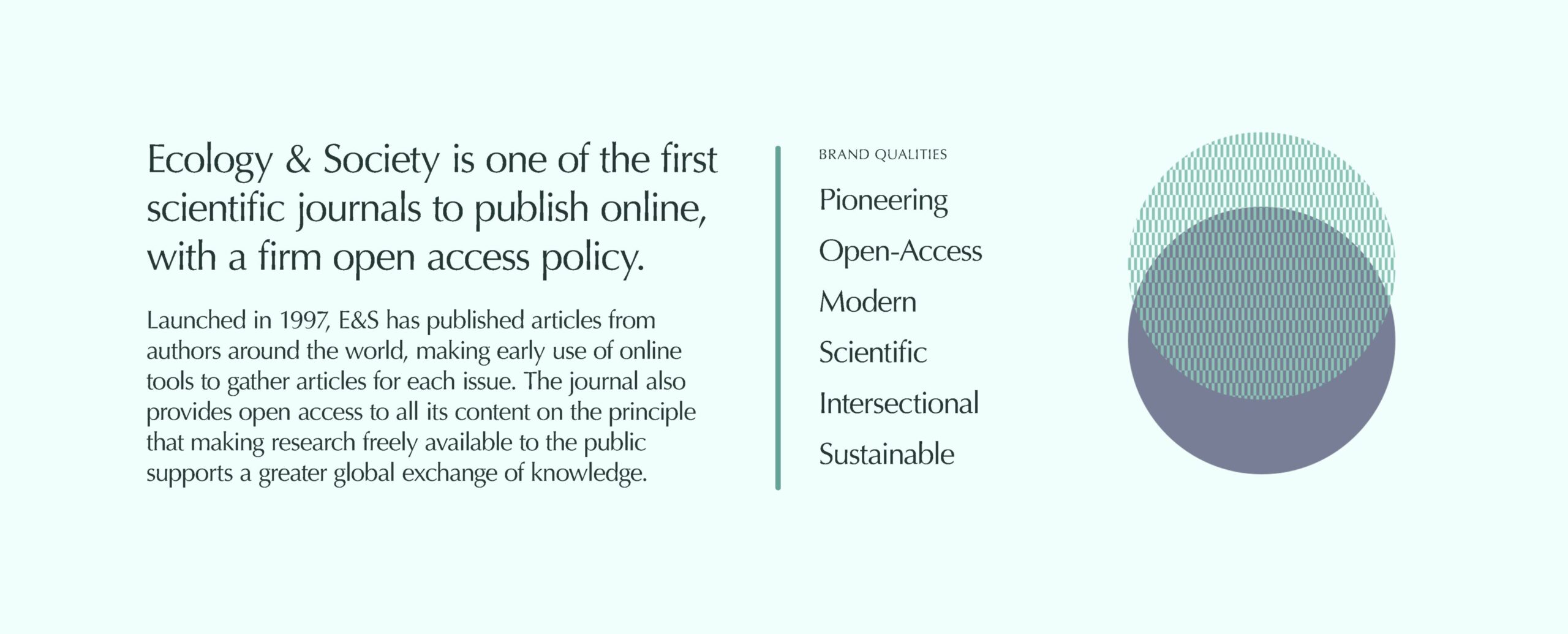
The result was a new identity that bridges people and planet. At its centre is a logo that combines the human fingerprint with a leaf, symbolizing the interconnectedness of society and ecology. Supporting graphics draw on mapping iconography and the textured aesthetics of early digital publishing — a nod to the journal’s pioneering spirit. An unexpected palette of greens and purples pushes beyond the clichés of sustainability, giving E&S a distinctive presence in a crowded landscape.
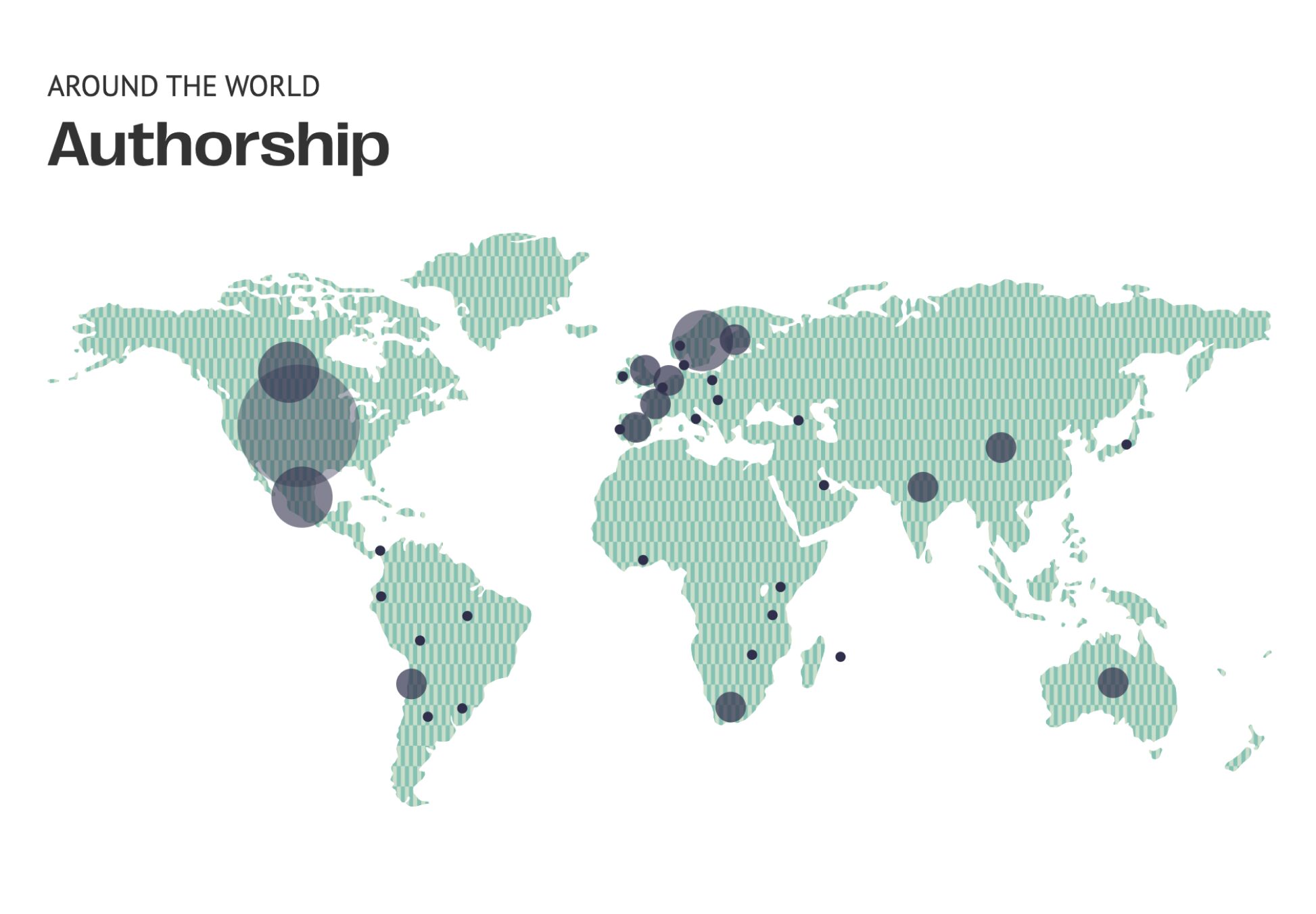
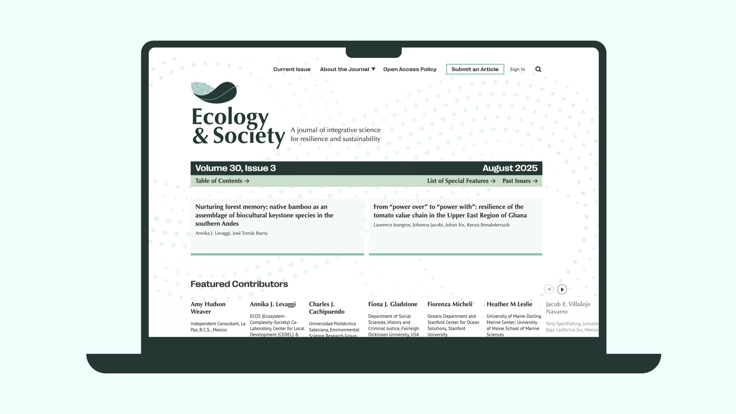
More than just a logo, we created a full brand system: flexible, modern, and practical for the journal’s internal team. Patterns, icons, and guidelines ensure consistency across platforms, while the visual identity gives E&S the clarity and credibility it needs to communicate its impact.
The response has been extraordinary. The rebrand was embraced enthusiastically by both academic and non-academic audiences, praised for balancing rigour with creativity. The success of the collaboration led to a second commission: the rebrand of Avian Conservation & Ecology, a sister journal. And when E&S relaunched its website with the new identity, it went on to win multiple awards — proof that thoughtful design can amplify not only how research is shared, but how it is valued.
For us, this project was a reminder of what design makes possible. By blending academic seriousness with creative intelligence, we helped a pioneering journal project its vision into the future. And in doing so, we reinforced something we believe deeply: when ideas are given the right tools, they travel further, faster, and with greater impact.